
Most task apps either feel like spreadsheets with checkboxes or like social feeds pretending to be productive. Todoes started from a simpler bet: people want to see what matters today, tag it in words they already use, and drill into subtasks without losing the thread. The home screen centers on Today with category tiles for Health, Work, Mental Health, and Others, each showing how much is still open so you know where the weight is before you scroll.
Creating and editing tasks is built around quick capture: title, optional subtasks, color-coded tags, reminders, and a save path that stays out of the way. Subtasks behave like a mini checklist inside a parent task, which is how real errands actually arrive (journal entry plus buy a notebook plus follow a tutorial, not three unrelated rows). Tags stay visible on the list so scanning feels like reading labels on a desk, not hunting through menus.
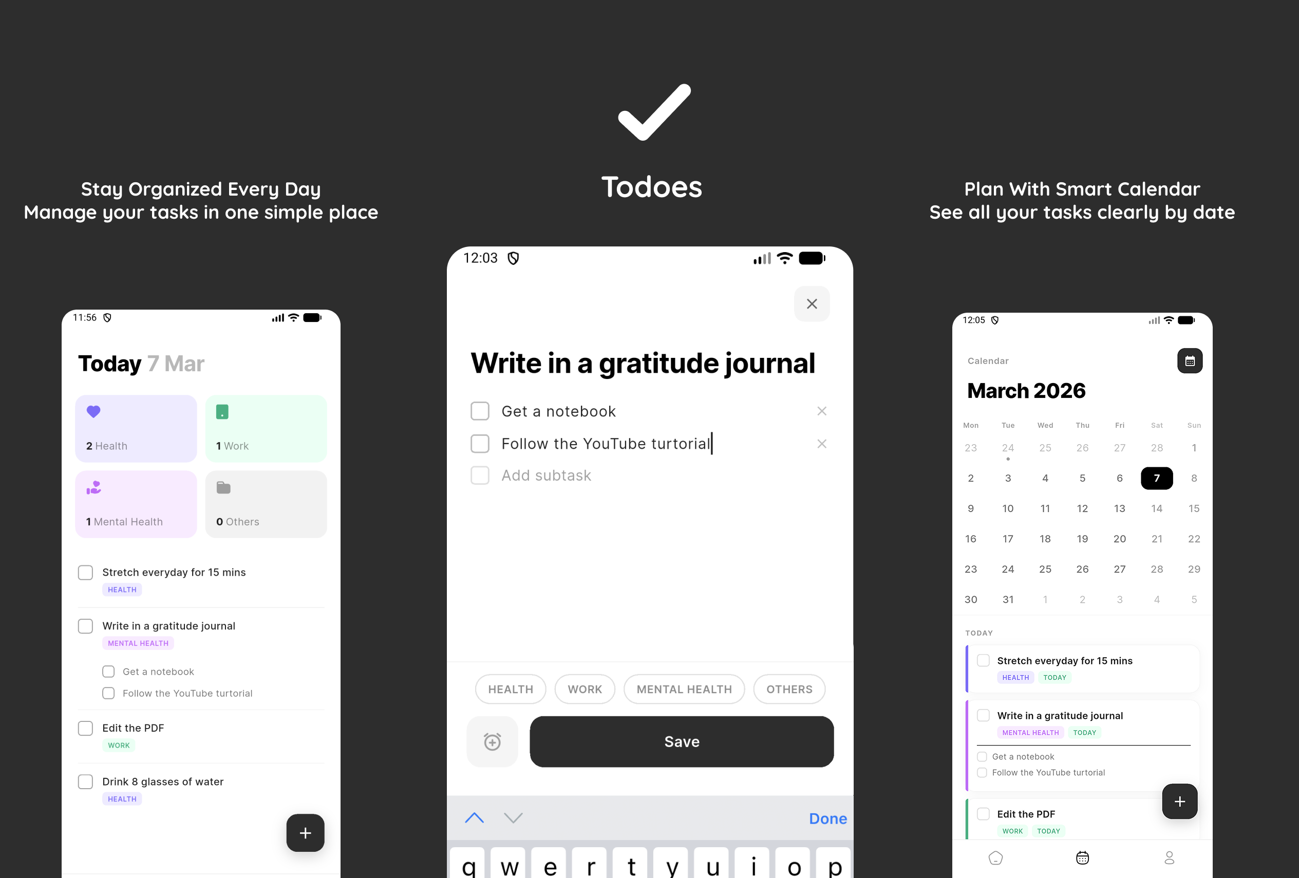
The calendar view answers the question Today cannot: what does the rest of the month look like? Selecting a date filters the list underneath so commitments stay tied to time without turning the app into a full project-management suite. Visual hierarchy uses soft category colors, bold headings, and enough whitespace that long lists still feel approachable on a phone screen.
Todoes is personal product work for me: design the flows I actually want to use, ship a coherent mobile UI, and keep scope honest. Organize every day, plan with a calendar that respects dates, and manage tasks in one simple place.